OPPO Find X5 Pro: aiuto, top di gamma finalmente in SCONTO
HYPE: il miglior modo per gestire le tue spese quotidiane
Echo Dot di 4ª generazione MAI VISTO a un prezzo così
Apple AirPods Pro: prezzo FOLLE su Amazon
Questo tablet 10″ è una BELVA ma te lo REGALANO a 112€ con custodia e tastiera
Linux Mint 21 “Vanessa” non adotterà systemd-oomd
Il team di sviluppatori guidato da Clem Lefebvre ha deciso che, per evitare problematiche tecniche, Linux Mint 21 “Vanessa” non adotterà systemd-oomd
OPPO A76, lo smartphone del momento super scontato su Amazon, solo per oggi

New ways to print your memories with Google Photos in Europe and Canada
We use photos for so many things: to decorate our homes, reminisce with family and friends, and make personalized gifts. But today, most (if not all) of our photos — our memories — are digital. That’s why Google Photos is adding new ways to print your photos, so you can easily celebrate and save life’s meaningful moments.
Today we’re starting to roll out the option for Google Photos users in Canada and 28 European countries* and Canada to create photo prints and canvas prints and have them delivered right to their home, in addition to photo books. And because Google Photos helps you keep your photos organized and searchable, it’s easy to find what you want to print even if you’re looking for a shot from years ago.
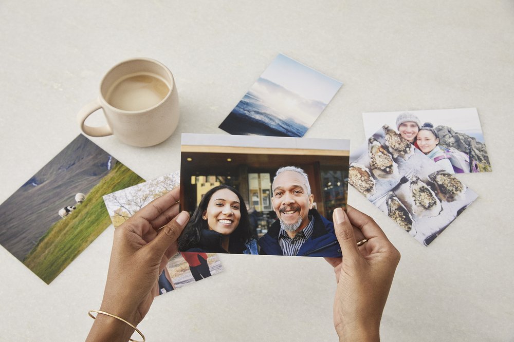
Turn your memories into photo prints
Google Photos now makes it easy to turn your memories into photo prints right from the app.
In Canada, photo prints start at $0.39 CAD each (plus shipping and tax) and are available in the following sizes (in inches): 4×4, 4×6, 5×7, 8×10, 11×14, 12×12, 12×18, 16×20, and 24×36 prints. In European locations where pricing is in EUR, photo prints start at 0.15 EUR each (plus shipping and tax) and are available in the following sizes (in centimeters): 10×10, 10×15, 13×18, 20×20, 20×30, 30×45, 40×60, 50×50, 50×75, 60×90 prints. Pricing for European locations with other currencies is listed in the Print store for those locations.
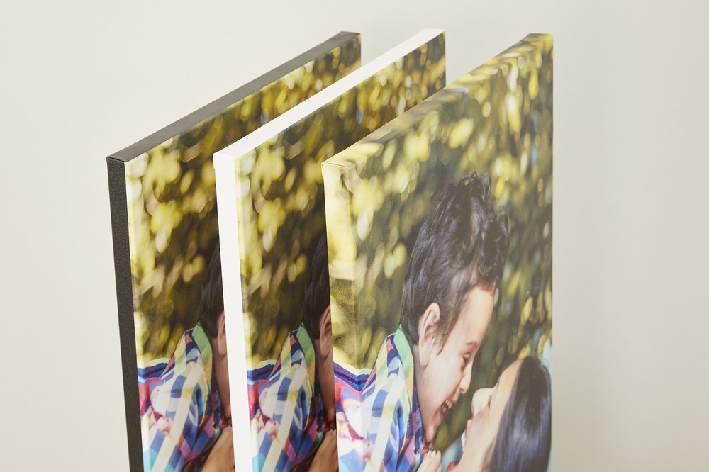
Decorate your home with canvas prints
You can now turn your favorite memories into wall art with canvas prints. Available in Canada in sizes ranging from 8×8 to 20×24 (in), and in Europe (in the same 28 countries) from 20×20 to 75×100 (cm), you can pick the perfect size for your space and fill your walls with memories.
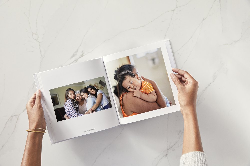
Of course, our classic Photo books are always a lovely way to remember a special trip or tell someone how much they mean to you. They’re also easy to make — start with a suggested photo book made for you, create one from an existing album or begin with a simple search through your photos. Photo books are available in both softcover and hardcover in the US, Canada and Europe.
With Google Photos, it’s easier than ever to get your memories off your phone and into your home so you can share them with the people you love.
* Available in Austria, Belgium, Bulgaria, Croatia, Cyprus, Czech Republic, Denmark, Estonia, Finland, France, Germany, Greece, Hungary, Ireland, Italy, Latvia, Lithuania, Luxembourg, Malta, Netherlands, Poland, Portugal, Romania, Slovakia, Slovenia, Spain, Sweden and the United Kingdom.
Amazon Echo di 4ª generazione ad un prezzo FOLLE: approfitta dello sconto del 35%
Telecomando universale WiFi intelligente IR: offerta pazzesca su Amazon
mpv: un media player pensato per gli sviluppatori
mpv è un player open source e multipiattaforma che permette di integrare le funzionalità di base tramite scripting
Building and testing helpful AR experiences
Augmented reality (AR) is opening up new ways to interact with the world around us. It can help us quickly and easily access the information we need — like understanding another language or knowing how best to get from point A to point B. For example, we recently shared an early AR prototype we’ve been testing in our labs that puts real-time translation and transcription directly in your line of sight.
However, testing only in a lab environment has its limitations. So starting next month, we plan to test AR prototypes in the real world. This will allow us to better understand how these devices can help people in their everyday lives. And as we develop experiences like AR navigation, it will help us take factors such as weather and busy intersections into account — which can be difficult, sometimes impossible, to fully recreate indoors.
We’ll begin small-scale testing in public settings with AR prototypes worn by a few dozen Googlers and select trusted testers. These prototypes will include in-lens displays, microphones and cameras — but they’ll have strict limitations on what they can do. For example, our AR prototypes don’t support photography and videography, though image data will be used to enable experiences like translating the menu in front of you or showing you directions to a nearby coffee shop.
It’s early, and we want to get this right, so we’re taking it slow, with a strong focus on ensuring the privacy of the testers and those around them. You can read more details about our limited public testing efforts for AR prototypes in the Google Help Center. As we continue to explore and learn what’s possible with AR, we look forward to sharing more updates.
Chiavetta USB, piccola come una moneta ma 128GB da STRAPAZZO
Blackview Tab 12 è il miglior tablet qualità-prezzo che puoi acquistare oggi

How we redesigned the Chrome icon
After more than eight years, we introduced a refreshed version of the Chrome icon for the 100th update for Chrome earlier this year. Today, I chatted with user experience interaction designer Elvin Hu and visual designer Thomas Messenger to go behind the scenes and learn more about how the Chrome icon was designed.
What was the Chrome icon meant to represent originally?
Thomas: When we introduced Chrome back in 2008, our goal was to build a browser that was fast and easy to use, and nothing better represented speed than a rocket ship! But our team decided to move away from a literal rocket ship in the end, and came to a design that looked approachable and clickable that still captured the spirit of Google.
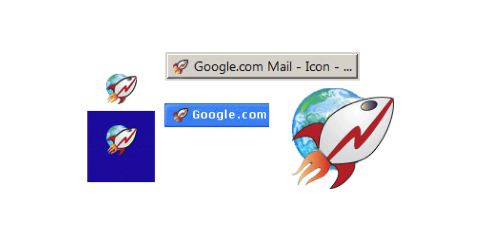
One of the first ideas for the Chrome icon
Why are you making this change now?
Elvin: The logo hadn’t been updated in eight years, and we wanted to give it a refreshed and modern look to reflect how Chrome has evolved as a product. We also noticed that the visual design of modern operating systems was becoming more stylistically diverse, so it was important that the Chrome icon felt more adaptable, native and fresh no matter what device you used.
How will the Chrome icon look different across operating systems?
Elvin: We simplified the main brand icon by removing the shadows, refining the proportions and brightening the colors, to align with Google’s current brand design. We also found that placing certain shades of green and red next to each other created an unpleasant “glow” between the two colors, so we introduced a very subtle gradient to the main icon to make the icon easier to the eyes compared to using flat colors. Then we created OS-specific customizations. We want the icons to feel recognizably Chrome, but also well crafted for each operating system.
It seems like a subtle change. Did you consider a more significant departure?
Thomas: We did! In the exploratory phase, we tried all kinds of ideas; softening corners, different geometries, whether or not to separate the colors with white. We also tried options that further departed from the overall shape we’ve been using for the past 12 years. But we knew how well the four Google colors and circular composition are recognized, so we decided not to deviate too much from that.
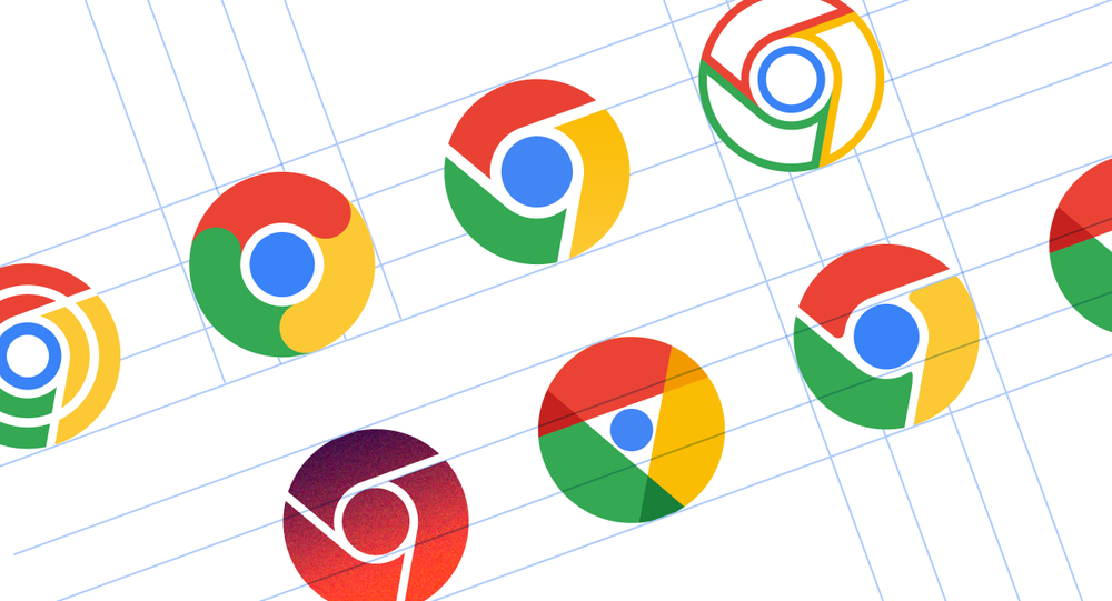
A few examples of proposed redesigns of the Chrome icon.
What surprised you about the design process?
Elvin: The design process was a fun and collaborative challenge for everyone involved. The team held virtual brainstorm sessions that produced a variety of concepts that strived to become the new “face” of Chrome.
After coming up with the overall direction, we stress tested many color, gradient and proportion options in different contexts. Even if the change to color is subtle, we wanted to ensure the icon would not get lost in any of the places it appears. At one point, we felt happy about a specific green gradient in the icon, but after comprehensive testing, we found that it blended in with the default Windows 11 wallpaper (and taskbar) – which is popular with lots of our users. It was tests like that which ensured our icon would work well everywhere.
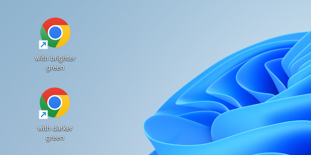
Caption: Several rounds of stress tests were conducted to ensure the icon’s color palette would work cohesively across platforms and contexts.
How did you think about making the icon more accessible to more communities?
Thomas: We revised the proportions of the central blue ball. Working with Googlers who are low-vision, we found that the refined proportions and updated central white stroke made it more recognizable. We also made different versions of the icon for small sizes to improve legibility and avoid fuzziness by aligning to pixel boundaries.
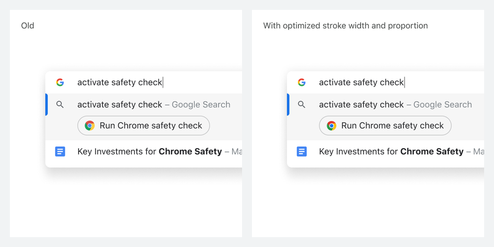
A side-by-side comparison of Chrome actions and how the updated icon improves legibility at smaller sizes and aligns to pixel boundaries.
Would you ever bring back the original Chrome icon?
Elvin: Never say never! We’ve investigated custom app icons, and found that each platform has different levels of support for it. Maybe one day we will bring it back as an option on platforms that support it.